"Conversations", by Randall Munroe, licensed under Creative Commons Attribution-NonCommercial 2.5 License
Alt Text
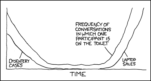
If the dysentery graph looks historically inaccurate it's because I got all my data from Oregon Trail.
"Conversations", by Randall Munroe, licensed under Creative Commons Attribution-NonCommercial 2.5 License
If the dysentery graph looks historically inaccurate it's because I got all my data from Oregon Trail.